
Me, KrafterPro or Divi 5
Hi All
I need a bit of help as I am not sure whats happened here.
I'm no coder or builder so bear with.
I done a Divi 5 update today and my menu headings there are only 4 were in the center at the top, after the update they went all the way over to the left, so I realigned back to the centre but the mobile dropdown is out of line. Pic attached.
Not sure why after the update the menu went left but I would like it in the centre along with the mobile dropdown in the centre.
I have moved everything back to the left for now.
Thank you.
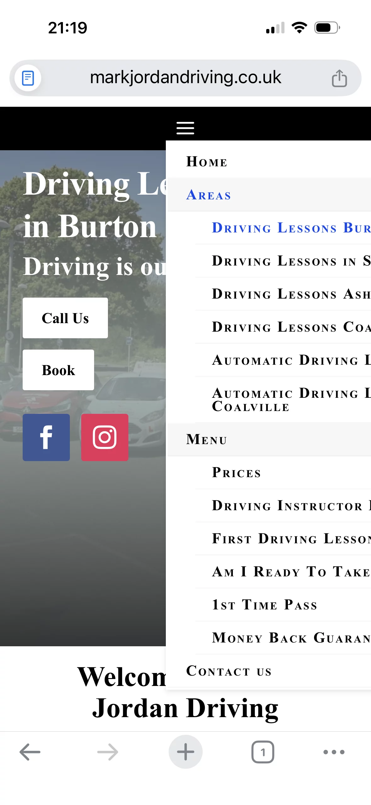

Hi Mark, went to your site, but in desktop and mobile mode, I still see the menu on the left, how did you align it to the center?


Also, in mobile, the menus are not collapsable, but in Divi5 you could create your own collapsable menu with the theme builder and the dropdown or accordion modules (not sure), but at least in Divi4 I managed to do this for one client with CSS:
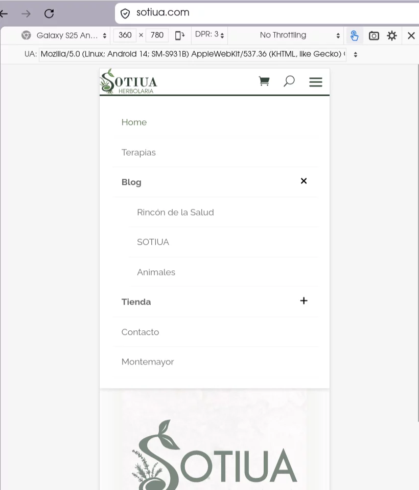
Here I leave you where I've put the CSS code and at the end the code, hope it helps (do some testing before and backup cause not sure if it will work with divi5:
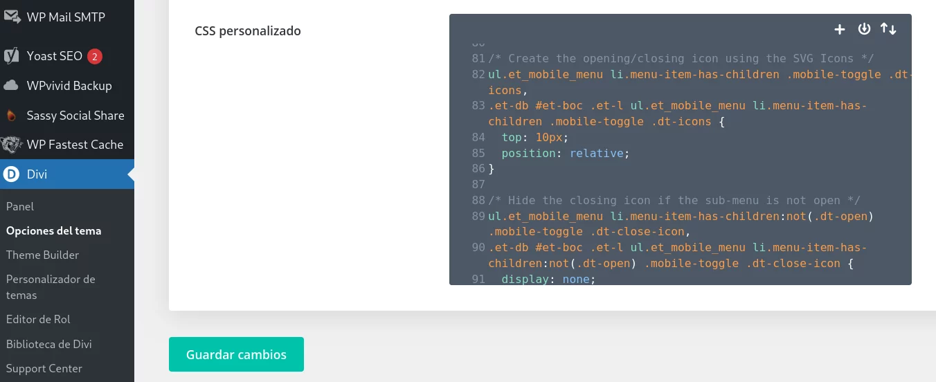
/ Proper Collapsable Mobile Menu /
/ Style the icon's placeholder /
ul.et_mobile_menu li.menu-item-has-children .mobile-toggle,
ul.et_mobile_menu li.page_item_has_children .mobile-toggle,
.et-db #et-boc .et-l ul.et_mobile_menu li.menu-item-has-children .mobile-toggle,
.et-db #et-boc .et-l ul.et_mobile_menu li.page_item_has_children .mobile-toggle {
width: 44px;
height: 100%;
padding: 0px !important;
max-height: 44px;
position: absolute;
right: 0px;
top: 0px;
z-index: 999;
background-color: transparent;
border-bottom: 0;
text-align: center;
}
ul.et_mobile_menu > li.menu-item-has-children,
ul.et_mobile_menu > li.page_item_has_children,
ul.et_mobile_menu > li.menu-item-has-children .sub-menu li.menu-item-has-children,
.et-db #et-boc .et-l ul.et_mobile_menu > li.menu-item-has-children,
.et-db #et-boc .et-l ul.et_mobile_menu > li.page_item_has_children,
.et-db #et-boc .et-l ul.et_mobile_menu > li.menu-item-has-children .sub-menu li.menu-item-has-children {
position: relative;
}
.et_mobile_menu .menu-item-has-children > a,
.et-db #et-boc .et-l .et_mobile_menu .menu-item-has-children > a {
background-color: transparent;
}
/ Hide the Sub-menu /
ul.et_mobile_menu .menu-item-has-children .sub-menu,
#main-header ul.et_mobile_menu .menu-item-has-children .sub-menu,
.et-db #et-boc .et-l ul.et_mobile_menu .menu-item-has-children .sub-menu,
.et-db #main-header ul.et_mobile_menu .menu-item-has-children .sub-menu {
display: none !important;
visibility: hidden !important;
}
/ Show the sub-menu when the + icon is clicked /
ul.et_mobile_menu .menu-item-has-children .sub-menu.visible,
#main-header ul.et_mobile_menu .menu-item-has-children .sub-menu.visible,
.et-db #et-boc .et-l ul.et_mobile_menu .menu-item-has-children .sub-menu.visible,
.et-db #main-header ul.et_mobile_menu .menu-item-has-children .sub-menu.visible {
display: block !important;
visibility: visible !important;
}
/ Create the opening/closing icon using the SVG Icons /
ul.et_mobile_menu li.menu-item-has-children .mobile-toggle .dt-icons,
.et-db #et-boc .et-l ul.et_mobile_menu li.menu-item-has-children .mobile-toggle .dt-icons {
top: 10px;
position: relative;
}
/ Hide the closing icon if the sub-menu is not open /
ul.et_mobile_menu li.menu-item-has-children:not(.dt-open) .mobile-toggle .dt-close-icon,
.et-db #et-boc .et-l ul.et_mobile_menu li.menu-item-has-children:not(.dt-open) .mobile-toggle .dt-close-icon {
display: none;
}
/ Hide the opening icon if the sub-menu is open /
ul.et_mobile_menu li.menu-item-has-children.dt-open > .mobile-toggle .dt-open-icon,
.et-db #et-boc .et-l ul.et_mobile_menu li.menu-item-has-children.dt-open > .mobile-toggle .dt-open-icon {
display: none;
}

Jorge Nava Tank you I will look into ths.
Mark Jordan Awesome, hope it helps :)