
Laundromat 1 website review
Hi Everyone! I co-own 2 laundromats with my husband and the websites are very simple. However,I'm not completely satisfied with the homepage for this one. I am stuck on the slider section towards the bottom. I want to redesign it, but I would love everyone's input.
I would also appreciate any issues you may have with mobile and overall user experience.
When I have the 2nd one header redesigned I will submit that one too.
https://sjlaundryhamper.com/

Jennifer A. the footer on mobile(Issue),
Overall the website looks cool. scope to improve the header and alignment across the blocks in pages
Thanks,
Kiran

Kiran Kumar Thank you for your input.

Jennifer A. The site looks really good. The main thing that could use a little attention is the footer, just as Kiran mentioned. Other than that, it looks great.
Mathias G Thank you for your input as well.

I agree with the other comments: the site is solid. It has a good user experience with clear CTAs leading to what matters - signing up for Dexter Pay in advance,FAQs, Pricing, etc.
I didn't run a full SEO scan but it's clear from the homepage and browsing the site you are following Local SEO best practices.
Regarding the slider in the footer - IMHO it's not necessary. You already do a nice job above with the where, why and social proof (reviews)
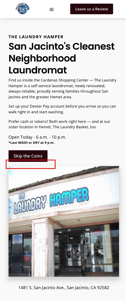
One small nit pick about spacing below the CTA button on mobile. See image below.
I wish the local laundromat I use for large blankets offered similar services!
- Charles
Charles Harman Thanks Charles for your great input as well. I really appreciate the time you, Kiran Kumar and Mathias G took to give me constructive feedback.