

Part 3 of our series on building collapsible content cards in Divi 5. Parts 1 and 2 covered the visual approach using Divi 5 Interactions. This part shows the CSS and JavaScript solution — smoother, cleaner, and with no duplicate content in your HTML.
Why This Approach Is Better Than the Visual Method
In Part 2 we built the expand and collapse behaviour using Divi 5 Interactions with two Text modules — one cropped preview and one full version. That approach works without any code, but it has a fundamental drawback: the same text content exists twice in your HTML. Search engines and screen readers see duplicated content, and every time you duplicate the card you have to manually update the Interaction targets in both buttons.
The CSS and JavaScript approach in this article uses a single Text module. The full text lives in one place. CSS limits how much is visible. JavaScript toggles a class to reveal or hide the rest. No duplicate content, no manual target updates after duplicating.
Additional improvements over the visual method:
- Smooth expand and collapse animation — no snapping
- Soft fade gradient at the bottom of the truncated text
- A single button that dynamically changes its own label
- Works automatically for every card on the page without individual configuration
The Module Structure in Divi 5
The structure is flat and clean. The outer Group module wraps everything and receives the CSS class that the JavaScript uses as its reference point:
Section
  └── Row
        └── Column              → CSS Class: card-outer
              └── Group module
                    ├── Heading module
                    ├── Image module
                    ├── Text module   → CSS Class: card-text
                    └── Group module  → CSS Class: card-buttons
                          └── Button  → CSS Class: btn-toggle
One Text module. One Button. No Interactions configured anywhere on any element.
How to Assign the CSS Classes
For each element above, open its settings and go to Advanced → Attributes → Add Attribute:
- Attribute Name:
class - Attribute Value: the class name shown in the structure above
The card-outer class goes on the Column, not the Group. To access the Column in Divi 5: click the Row gear icon → properties panel → Content → Elements → Column.
Set an Admin Label in the Content tab of every module. This keeps the Layers panel readable and makes duplication manageable.
The Complete CSS
Paste this into Divi → Theme Options → General → Custom CSS, or into your child theme's style.css:
/* ================================================
   STACK CARDS — sticky card layout
   ================================================ */

/* Settings */
:root {
  --navbar: 120px;
  --peek:   40px;
}

/* Combine Divi's own class with custom class
   to win against Divi's CSS specificity */
.et_pb_row.stack-card {
  position: sticky !important;
  border-radius: 16px;
  margin-bottom: 60vh !important;
  z-index: 1;
}

.et_pb_row.stack-card-1 { top: calc(var(--navbar) + 0 * var(--peek)); z-index: 1; }
.et_pb_row.stack-card-2 { top: calc(var(--navbar) + 1 * var(--peek)); z-index: 2; }
.et_pb_row.stack-card-3 { top: calc(var(--navbar) + 2 * var(--peek)); z-index: 3; }

/* Overflow fix for the section container */
.et_pb_section:has(.stack-card) {
  overflow: visible !important;
}


/* ================================================
   CARD TEXT — collapsible text block
   ================================================ */

/* Limit the visible height of the text block */
.card-text {
  max-height: 96px;
  overflow: hidden;
  position: relative;
  transition: max-height 0.5s ease;
}

/* Soft fade gradient at the bottom edge */
.card-text::after {
  content: "";
  position: absolute;
  bottom: 0;
  left: 0;
  right: 0;
  height: 56px;
  background: linear-gradient(transparent, #ffffff);
  /* Change #ffffff to match your card background colour */
  pointer-events: none;
  transition: opacity 0.3s ease;
}

/* Expanded state: release the height limit */
.card-text.is-open {
  max-height: 2000px;
}

/* Expanded state: fade the gradient out */
.card-text.is-open::after {
  opacity: 0;
}


/* ================================================
   CARD BUTTON — toggle button label
   ================================================ */

/* Stabilise button position and prevent flash on load */
.btn-toggle {
  position: relative;
  overflow: hidden;
}

/* Freeze the border so it does not animate on load */
.btn-toggle,
.btn-toggle:hover,
.btn-toggle:focus,
.btn-toggle:active {
  border-width: 2px !important;
  border-style: solid !important;
}

/* Hide the original label set in the Divi builder */
.btn-toggle .et_pb_button_text {
  visibility: hidden;
}

/* Show the initial label via CSS using ::before
   — leaves Divi's own ::after hover effect untouched */
.btn-toggle::before {
  content: 'Read more \2193';
  visibility: visible;
  position: absolute;
  left: 0;
  right: 0;
  text-align: center;
  z-index: 2;
}

/* Switch label when card is in expanded state */
.btn-toggle.is-active::before {
  content: 'Read less \2191';
}
The Complete JavaScript
Way 1 — Divi Theme Options (no child theme needed)
Go to Divi → Theme Options → Integration and paste the following into the field "Add code to the \ of your blog":
<script>
document.addEventListener('DOMContentLoaded', function() {

  /* Find all toggle buttons on the page */
  document.querySelectorAll('.btn-toggle').forEach(function(btn) {

    /* Target the inner text element — Divi wraps button text in a span */
    var btnText = btn.querySelector('.et_pb_button_text') || btn;

    /* Set initial label directly on the text element */
    btnText.textContent = 'Read more \u2193';

    btn.addEventListener('click', function(e) {

      /* Prevent the browser from following the button link */
      e.preventDefault();

      /* Prevent the click event from bubbling up to parent elements */
      e.stopPropagation();

      /* Find the card container that holds this button */
      var card = this.closest('.card-outer');

      /* Find the text block inside that card */
      var text = card.querySelector('.card-text');

      /* Toggle the expanded state on the text block */
      var isOpen = text.classList.toggle('is-open');

      /* Update the inner text element directly */
      var btnText = this.querySelector('.et_pb_button_text') || this;
      btnText.textContent = isOpen ? 'Read less \u2191' : 'Read more \u2193';
    });
  });

});
</script>
Way 2 — Child Theme (recommended for professional builds)
Create the file wp-content/themes/[your-child-theme]/js/card-toggle.js with this content (no script tags):
document.addEventListener('DOMContentLoaded', function() {

  /* Find all toggle buttons on the page */
  document.querySelectorAll('.btn-toggle').forEach(function(btn) {

    /* Target the inner text element — Divi wraps button text in a span */
    var btnText = btn.querySelector('.et_pb_button_text') || btn;

    /* Set initial label directly on the text element */
    btnText.textContent = 'Read more \u2193';

    btn.addEventListener('click', function(e) {

      /* Prevent the browser from following the button link */
      e.preventDefault();

      /* Prevent the click event from bubbling up to parent elements */
      e.stopPropagation();

      /* Find the card container that holds this button */
      var card = this.closest('.card-outer');

      /* Find the text block inside that card */
      var text = card.querySelector('.card-text');

      /* Toggle the expanded state on the text block */
      var isOpen = text.classList.toggle('is-open');

      /* Update the inner text element directly */
      var btnText = this.querySelector('.et_pb_button_text') || this;
      btnText.textContent = isOpen ? 'Read less \u2191' : 'Read more \u2193';
    });
  });

});
Then add this to your child theme's functions.php:
function mytheme_enqueue_card_scripts() {
    wp_enqueue_script(
        'card-toggle',
        get_stylesheet_directory_uri() . '/js/card-toggle.js',
        array(),
        '1.0.0',
        true  /* load in footer, before </body> */
    );
}
add_action( 'wp_enqueue_scripts', 'mytheme_enqueue_card_scripts' );
Important: if your functions.php already contains a wp_enqueue_scripts function, add the wp_enqueue_script line inside the existing function — do not create a second function with the same name.
Security Notes
Only paste code you have read and understand. JavaScript added to your WordPress site runs on every page for every visitor. Code from unknown sources can steal session data, inject unwanted content, or open your site to attacks. The code in this guide contains no external requests, no data collection, and no eval() calls.
Never use eval(). The eval() function executes arbitrary strings as JavaScript. It is rarely necessary in legitimate code and is a common vector for injected malicious scripts. If you encounter code containing eval(), treat it with caution.
Use wp_enqueue_script, not direct script tags. In functions.php, always register scripts through WordPress's enqueue system. Never output <script> tags directly from PHP — this bypasses WordPress's dependency and caching management.
Increment the version number after updates. When you modify card-toggle.js, change '1.0.0' to '1.0.1' in the enqueue call. Browsers cache JavaScript aggressively — without a version change, visitors may see the old version for hours after your update.
What to Test After Adding the Code
Always test in the live frontend — not in the Divi Visual Builder. The builder loads its own scripts that can interfere with the results. Use a private / incognito window for the most accurate test.
- Initial state — text cropped to approximately four lines, fade gradient visible, button shows "Read more ↓"
- Expand — smooth animation, fade disappears, button switches to "Read less ↑"
- Collapse — smooth animation back, fade reappears, button returns to "Read more ↓"
- Multiple cards — duplicate the card, confirm each button only affects its own card
- Background colour — if your card background is not white, update
#ffffffin the CSS gradient - Mobile — check that 96px still shows approximately four lines at your mobile font size
- No page jump on click — the button should not scroll the page
- No flash on load — button border and label should appear immediately without flickering
One Text Module vs. Two Text Modules — Summary
Visual method (Part 2) CSS + JS method (this article) Code required None CSS + JS Text modules needed Two (duplicate content) One Duplicate content in HTML Yes No After duplicating the card Manual target updates needed Nothing to update Smooth animation No — snaps Yes Fade gradient No Yes Single button with dynamic label No — two buttons needed YesThis post is part of a series on building smarter, more interactive layouts in Divi 5
I’ve put together a small collection of tests on this page. Just a heads-up: it’s all about functionality, not aesthetics! This page isn't going to win any beauty contests, nor is it meant to. Its purpose is simply to show whether certain elements work for the blog posts on diviuniversity.com.
If you’re interested, feel free to rebuild these setups yourself and then use the KrafterPRO presets to create a truly beautiful design. This link will only be active for a short time. Thanks for understanding!


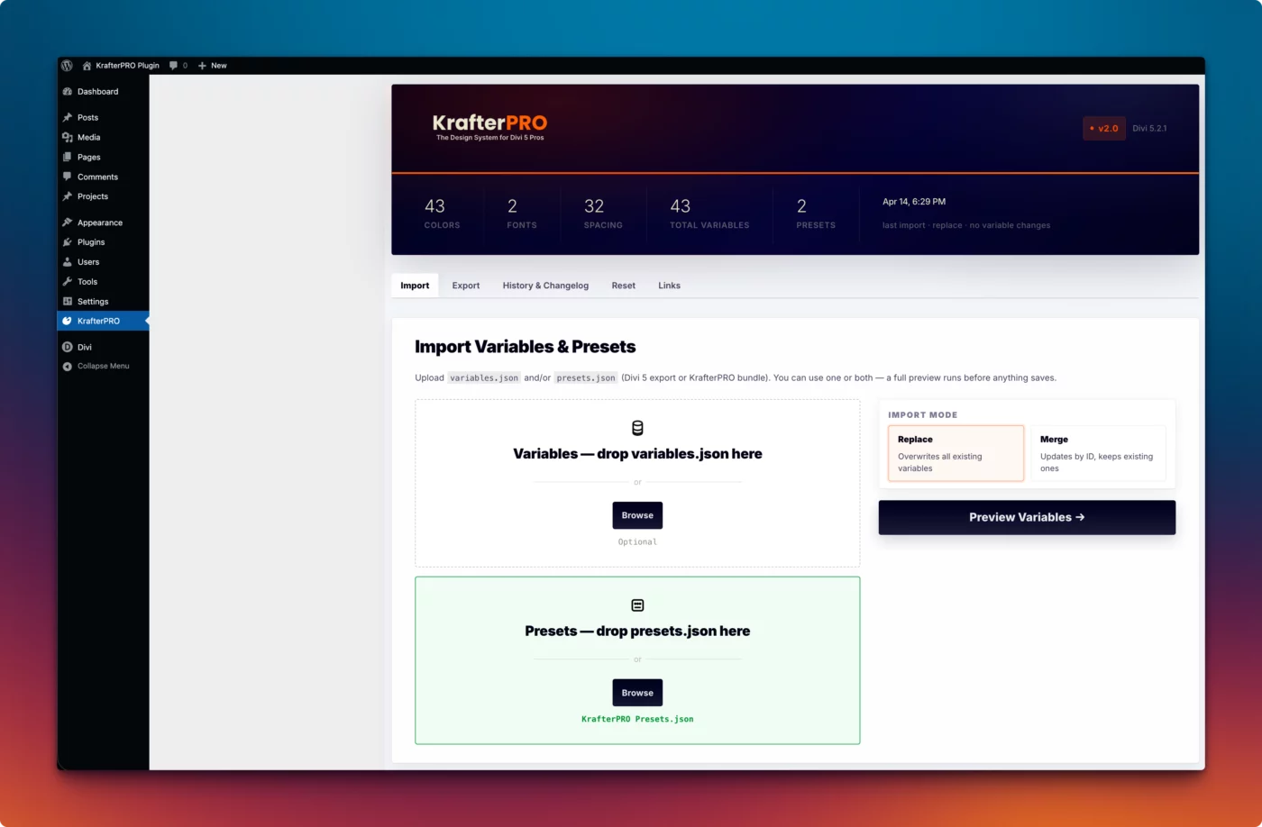
I just got a message from ET on how to build an image hover reveal effect. When I watched the video (10 minutes) it showed all the steps needed to format the example. Two things stood out to me. First, it used individual formatting elements, all of which are automated with KrafterPRO. Second, none of the settings were part of a system. They were just random choices. This video illustrated all of the things Mak has shown to be the least effective way to build in Divi 5. If you have a few minutes to spare, it's worth the time to see an independent video that proves the value of KrafterPRO.
The Divi Mastery Course has New lessons 😅
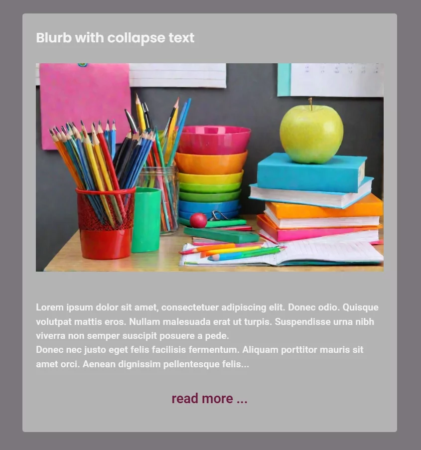
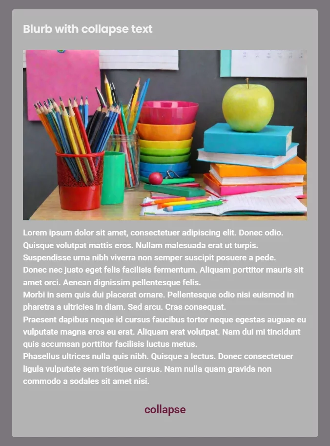
A custom Blurb module with a 'Read More' feature:
This setup allows you to show a short snippet first, expand it via a 'Read More' button, and reset it using a 'Collapse' button. The best part? This approach is purely visual—no JS or CSS required.
The Setup:
First, build your own Blurb structure: Section > Row > Heading + Image + Text (short) + Text (long) + Group (with 2 buttons). If you like, you can also group the Heading/Image and the two Text modules for better organization.
The Logic: Divi 5 Interactions
The magic happens entirely within the Divi 5 Interactions. To avoid a 'trial and error' nightmare, it’s essential to name your elements in the Layers View.
- I named my text fields
text_shortandtext_long. - The buttons are labeled
button_moreandbutton_less(collapsed).
The Configuration:
To ensure the correct initial state, go to the Section settings and assign two 'Load' interactions:
- On Load > Hide Element: Target
text_long. - On Load > Hide Element: Target
button_less.
Now for the 'click' functionality: You’ll need to create four click interactions for each button (Toggle Show/Hide for the respective text and button elements). Again, naming these interactions will help you keep track of everything.
It’s a bit of 'busy work,' but the result is a clean, no-code solution. Have fun rebuilding it! You can find a link to my demo Blurb here for a limited time—it might not win any beauty contests, but it perfectly demonstrates the functionality.
Check out the link here (available for a limited time)
https://discover.schlatter-waldshut.de/testmyblurb/
One could certainly improve this by using anchor links (jump marks), so that with longer texts, the browser focuses on the start of the content rather than the image. This prevents users from having to manually scroll or adjust with their fingers.
It’s also worth noting that using two text fields and two buttons per module does increase the amount of code. Divi 5 isn't exactly known for producing less bloat than previous versions, partly due to backward compatibility. If you're planning to use many of these 'Blurbs' or text blocks on one page, a custom JS/CSS solution would be more efficient.
However, this experiment shows that Divi 5 is capable of quite a lot. There are many more events to explore for creating great effects without the need for custom scripts or CSS code.
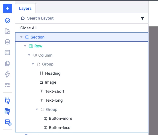
Interactions in button read more...
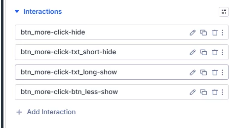
You will find the right action for the colapse button...
This got me thinking: Can this be solved purely visually in Divi, or would it turn into endless klicking solution in Divi5 Modul-Design depending on how many Blurb modules are used side-by-side?
It then occurred to me that with responsive and fluid design, these modules are stacked vertically on mobile devices. In that context, it actually prevents an endless scrolling; users can simply expand the specific content they’re interested in.
So, I dove straight into the research, and here is the first overview I’ve put together to share with the community.
Here you'll find KC Farmers Post: https://diviuniversity.com/portal/space/divi-community/post/formatting-question
What Divi 5 Can Do Visually — And Where CSS or JavaScript Still Come In
What Divi 5 Handles Entirely on Its Own, No Code Needed
Starting with the good news: the visual editor in Divi 5 is genuinely impressive. For the vast majority of design decisions, you will never need to open a code editor.
Spacing, typography, colours, hover effects, responsive breakpoints, entrance animations, background options, filters, and transforms — all of this lives natively in the builder. You can save any combination of these settings as a Preset and apply it to other modules across your site in one click. Divi 5 also introduced Design Variables, which let you define global values for colours, fonts, and spacing, so a single change updates your entire site at once.
The Big News: Divi 5 Interactions
In June 2025, Elegant Themes released the Interactions system for Divi 5 — a visual, no-code tool built directly into the Advanced tab of every module, row, column, and section. With it, you can wire up genuine interactivity without writing a single line of JavaScript.
Every interaction is built from three pieces: a Trigger (what starts it), an Effect (what happens), and a Target (which element on the page is affected).
Triggers you can choose from:
• A visitor clicking an element
• A visitor hovering over or moving away from an element
• An element entering or leaving the visible screen area as the user scrolls
• The page finishing loading, with an optional time delay
Effects you can apply:
• Toggling an element between visible and hidden
• Showing or hiding an element
• Toggling, adding, or removing a Preset from an element
• Toggling, adding, or removing an HTML attribute such as a CSS class
• Setting or removing a browser cookie
• Smoothly scrolling the page to a specific element
• Making an element follow the visitor’s mouse movement
The target can be any element on the page — not just the element the visitor clicked.
What Interactions Can Now Do — Without Code
Showing and hiding a text block on click is now entirely visual. Set the text module to hidden by default, add an Interaction to your button with a Click trigger and a Toggle Visibility effect, and point it at the text module.
Multiple independent text blocks side by side also work without code. Because each Interaction targets a specific element, clicking the button on one blurb only affects that blurb. The others stay exactly as they are.
(As Mak has already shown in his YouTube videos, I don't necessarily use the standard Blurb module. Instead, I build my own by using a Heading module, Image module, Text module, Button module, and Group modules where they make sense. And Yes, I always use the KrafterPRO Presets for the consistend, fluid and responsive design.)
Popup overlays, content reveals, anchor scrolling — all covered natively by Interactions, including controlling visibility with a close button inside the popup itself.
The Semantic Elements Route: Toggles Without Anything Extra
Divi 5 also introduced support for Semantic Elements, which allows you to change the HTML tag that any Divi container or module outputs. This unlocks a very clean approach to expand/collapse toggles.
Modern browsers support two native HTML elements — details and summary — that handle expand and collapse behaviour completely on their own, with no JavaScript and no CSS required for the basic functionality. Keyboard accessibility is built in. Screen readers understand the open and closed states automatically.
In Divi 5, you assign these element types directly in the builder’s Advanced tab. A small amount of CSS makes the animation smooth and the styling match your design — but the fundamental open/close behaviour needs nothing extra at all. An excellent option for FAQ sections and product detail toggles.
Where Divi 5 Interactions Currently Has Limits
The Interactions system is powerful, but it is still a first iteration and has some genuine gaps worth knowing about.
Smooth animation on show/hide transitions is the most noticeable current limitation. When you toggle an element’s visibility using Interactions, it currently snaps rather than animating smoothly. Elegant Themes has confirmed that more animation control is coming, but for now, a soft fade-in or smooth expand still needs a few lines of CSS.
A single button whose text changes between two states — switching from “Read more” to “Read less” — is not directly supported by a single button module. The workaround is two button modules layered on top of each other, each controlling the other’s visibility alongside the text block. This works visually, but a single button with dynamic text still requires JavaScript for the elegant version.
Fading out text at a specific height — where text trails off with a gentle gradient before the “Read more” button — cannot be created through the visual editor. This visual effect requires CSS. The same applies to limiting a text block to an exact height in pixels or rem units.
Which Approach for Which Situation
Now that we have the full picture, here is a clear breakdown of when each approach makes sense.
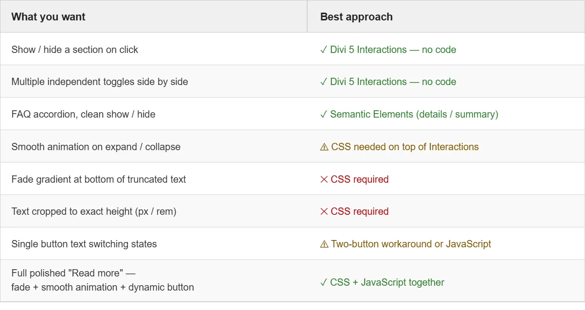
Use Divi 5 Interactions (purely visual) when you want to show or hide entire sections, modules, or elements on a click or scroll trigger. Covers most toggle use cases, popups, content reveals, and multiple independent collapsible blocks side by side. If you do not need a fade effect, Interactions handles it completely.
Use the Semantic Elements approach (visual + optional CSS) for FAQ-style content where the full text appears and disappears on click. The browser handles the logic natively. A small amount of CSS makes it smooth and styled.
Add CSS on top of Interactions when you want smooth animation instead of a snap, a fade-out gradient at the bottom of truncated text, or precise control over visible text height.
Add JavaScript when you need a single button whose label changes dynamically, or when the interaction logic becomes more complex — for example, when clicking one item should close all other open items simultaneously.
Use CSS and JavaScript together for the most polished result: text visually cropped with a soft fade, expanding smoothly on click, with a button that cleanly switches between “Read more” and “Read less.”
The Bigger Picture
Divi 5 has moved considerably closer to a genuine no-code experience for interactive elements. The Interactions system is a real leap forward, and the addition of Semantic Elements opens up approaches that are cleaner and more accessible than most plugin-based solutions.
That said, CSS and JavaScript still have their place — not as workarounds for a limited tool, but as the right tools for specific jobs. CSS handles visual presentation with precision that no GUI will ever fully match. JavaScript handles dynamic logic and stateful behaviour. Divi 5 handles the architecture, the layout, and a growing portion of the interaction layer.
Understanding where each one fits is what separates a page that works from a page that works beautifully.
In the next part of this series, we will build the “Read more” toggle three different ways — one using only Divi 5 Interactions, one using the Semantic Elements approach, and one using the full CSS and JavaScript combination — with step-by-step instructions and everything you need to copy and paste directly into Divi 5.
This post is part of a series on building smarter, more interactive layouts in Divi 5.

Can't seem to work this one out. Tried following Mark's video comparing Flex and Grid, but don't see any autogrid options anywhere. Mark seemed to use a preset in the video, so wondered how I could do this?

Hi All
I just felt I needed to share my success.
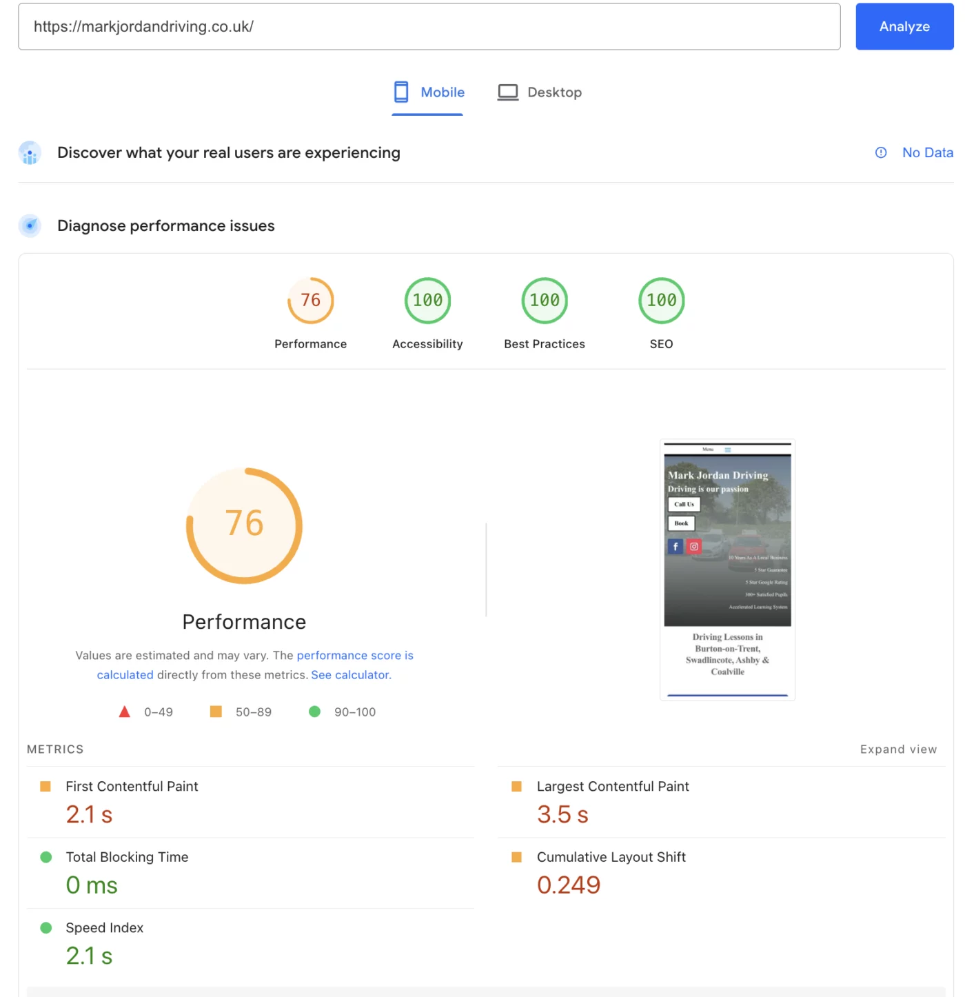
I am no builder / freelancer or coder and I have just finished my website using Divi 5 and Mak's KrafterPro.
It was tricky getting to use to it at first but, I continued and the results are just what I wanted.
It's no fancy site with loads of swirls and sliders etc but it does what I need it to do.
I would just like to thank Mak for the system and everyone that has helped me along the way.
I just have a few pages to finish touching but the main pages I rely on are working great.
Thanks again everyone.